How to typeset Japanese using (Xe)LaTeX
Typing Japanese on a Western keyboard is rather easy to setup, be it on Linux, Mac OS or Windows. One can usually type the Romaji version, such as “kyou”, and will obtain “きょう” if the input method is set up properly. Katakana/Kanji versions can usually be obtained by hitting the [Space] key multiple times, and small letters (e.g., “small tsu”) by prefixing them with “l” (lowercase “L”); for example, type “pa-teli-[SPACE]” to get “パーティー”. But how is it possible to typeset Japanese text with TeX?
Using XeTeX/XeLaTeX, which supports UTF-8 input encoding and OpenType fonts, it has become very easy to get Japanese text into your TeX documents – just write it into the document as described above. For example, a minimal document that can be compiled using xelatex looks as follows:
\documentclass{article}
\usepackage{xltxtra}
\setmainfont[Mapping=tex-text]{Kozuka Gothic Pro M}
\begin{document}
hello = こんにちは
\end{document}
There is nothing special/Japanese-specific happening here, except that you have to select a font that contains all the characters you want to use. The font used above, “Kozuka Gothic Pro”, is from Adobe and can be downloaded for free, for example at Fontpark.
Now if you want to use TeX for anything serious, you will probably have more advanced requirements when typesetting Japanese, like:
- vertical text,
- different fonts for Western and Japanese sections,
- proper alignment on a square grid,
- Furigana (Hiragana above/below Kanji characters),
- etc.
The following example combines information from http://mesokosmos.blogger.de/stories/1818274/ (for xeCJK options) and http://www.ntg.nl/maps/36/03.pdf (for general XeTeX information and vertical text in particular). It shows how to use a custom OTF font for regular (Western) text, a different OTF font for Japanese characters, and how to switch to vertical typesetting.
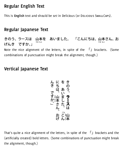
To whet your appetite, the result looks as follows:
And here is the documented source code:
\documentclass[12pt]{article}

\usepackage{xltxtra, setspace}

%% fonts

% xeCJK options from <http://mesokosmos.blogger.de/stories/1818274/>:
\usepackage[%
  boldfont,
  CJKnumber,
  CJKchecksingle
]{xeCJK}

% main font for CJK input from <http://www.fontpark.net/en/font/kozuka-gothic-pro-m/>
\setCJKmainfont[Script=CJK]{Kozuka Gothic Pro M}
% \setCJKmainfont[Script=CJK]{Kozuka Mincho Pro}

% version of the above font with rotated characters for vertical text,
%  font needs to come with ``vrt2'' feature
\setCJKfamilyfont{cjk-vert}[Script=CJK,RawFeature=vertical]{Kozuka Gothic Pro M}
% \setCJKfamilyfont{cjk-vert}[Script=CJK,RawFeature=vertical]{Kozuka Mincho Pro}

% main font for non-CJK input from <http://www.exljbris.com/delicious.html>
\setmainfont[Mapping=tex-text, SmallCapsFont={Delicious SmallCaps}]{Delicious-Roman}

%% Furigana

% use \ruby{kanji}{kana} to set Furigana
\usepackage[CJK,overlap]{ruby}
% position of Furigana: below/right
\renewcommand{\rubysep}{-3.9ex}
% increase line space for Furigana
\onehalfspacing

%% alignment

% also from <http://mesokosmos.blogger.de/stories/1818274/>:
\XeTeXlinebreaklocale "ja"
\XeTeXlinebreakskip=0em plus 0.1em minus 0.01em
% we also drop paragraph indentation in order to get proper alignment
\setlength{\parindent}{0pt}

\begin{document}

\section*{Regular English Text}

This is \textbf{English} text and should be \textit{set} in Delicious
(or \textsc{Delicious SmallCaps}).

\section*{Regular Japanese Text}

きのう、ラースは \ruby{山}{やま}\ruby{本}{もと}を あいました。
「こんにちは、\ruby{山}{やま}\ruby{本}{もと}さん。おげんき ですか。」

Note the nice alignment of the letters, in spite of the 「」 brackets.
(Some combinations of punctuation might break the alignment, though.)

\section*{Vertical Japanese Text}

\begin{figure}[h!]
\begin{center}
\rotatebox{-90}{
\begin{minipage}{0.35\textwidth}
\CJKfamily{cjk-vert}
\onehalfspacing % needs to be repeated here (?!)
きのう、\textbf{ラース}は \ruby{山}{やま}\ruby{本}{もと}を あいました。
「こんにちは、\ruby{山}{やま}\ruby{本}{もと}さん。おげんき ですか。」
\end{minipage}
}
\end{center}
\end{figure}

That's quite a nice alignment of the letters, in spite of the 「」 brackets
and the (artificially created) bold letters. (Some combinations of punctuation
might break the alignment, though.)

\end{document}